3 tips to Sustainable and Ethical Human-Centered Design

Some wonderful products and experiences were created with good intentions to improve people’s lives. But sometimes there’s a flip side to the gold medal. You might have heard the story of Airbnb: what a brilliant service bringing about a circular economy model, a more sustainable and sometimes cheaper alternative to hotels. Little did we know about the impact it could have on rent, making it unaffordable for locals and creating gentrification in cities like NYC, Paris and Rio. Or take the example of the Facebook Like button. It was created with the intention of spreading positivity and love around the world. Did we anticipate the addiction to social confirmation it would create?
In case you are new or unfamiliar with the world of design, Human-Centered Design is a methodology developed a few decades ago that gives a framework and process to problem solving, starting from the principle of placing people (end users and businesses) in the center to develop an empathetic understanding of their needs, context and pains. And the process works! With activities like research, personas, user interviews, prototyping and user testing, designers gather insights to create solutions tailored to the end users and business involved. It works in an anthropocentric world, where “human beings are the most important entity in the universe.”
But if we take a step back and zoom out from the “human” to look at the world and system we are all part of — a world where inequalities and climate change are some of the most pressing issues. We ask ourselves, how can we evolve our design practices to ensure that what we create has a positive impact for people, the society and the planet?
Because whether we’re working on a platform’s notifications, a dashboard or an e-commerce site, design decisions impact how people receive and process information that influences their actions. We make decisions every day about how to design, build and host what we create. And we are responsible for the things we bring into this world. So we ought to reflect upon our work through a wider lens than just user, business and tech.
As designers, we can embrace this challenge to evolve. From design strategy to production, here are three areas to explore
1. Re-think human-centricity
This is about zooming out and looking at the system users and businesses are part of, yes. It’s also about figuring out which sustainable and ethical questions should be addressed when planning research, deciding what touchpoints are important in the user journey and which principles will drive design decisions. Often, we design to minimize inconvenience and reduce friction. What if, instead, we could design to motivate people to think more about the impact of their actions and give them the opportunity (and rationale) to transition from the most convenient options to the most sustainable ones. Design can advance human behavior. And in today’s world, behaviors do need to change. But let’s not forget that it should be up to the individual to make up their own mind.
Planet centric design toolkit
For every project, designers can define which activities and tools to use depending on the project needs. In this Planet Centric Design toolkit you will find workshop activities and examples to take or tweak for your project. Have you used these or a similar toolkit? We’d love to hear about it!
2. Speculate on probable scenarios
Think about unintended consequences your design, product or feature could create. Could it, unintentionally, cause your users to feel stressed or emotionally exhausted or worried?
Behavior pre-mortem
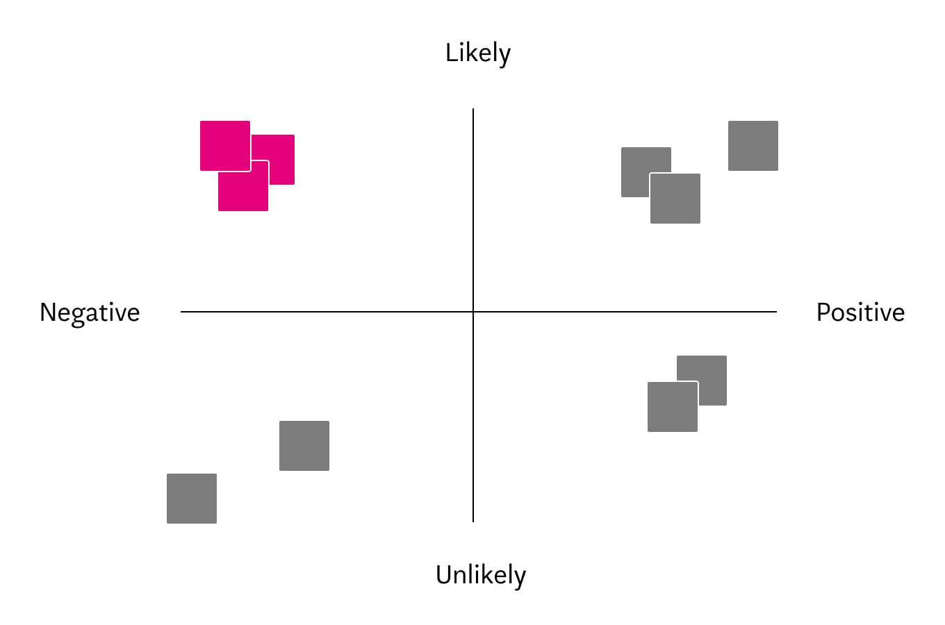
This exercise can help anticipate chains of reactions. Gather your team and have everyone write down the answers to these questions on a post-it:
- What behaviors do we hope would improve if our vision, product or feature goes well?
- What behaviors would people feel more / less comfortable doing?
- If a nefarious group of people had access to our product or feature, what could they do with it?
Then cluster the post-its into a 2x2 graph as illustrated below. Negative → Positive X Unlikely → Likely to happen. Look at the post-its in the “negative and likely to happen” quadrant — these are the ones needing further investigation.

Human sensitivities
Human sensitivities are instincts that are often vulnerable to new technologies. Developed by the Center for Humane Technology, the Humane Design Guide can help identify design elements that can be improved to support or elevate human wellbeing.
3. Design responsibly — reduce your digital carbon footprint
The internet produces a lot of CO2 — as much as the global air travel industry, according to the Mozilla Internet Health Report. So let’s roll up our sleeves and see where we can reduce some of it. Start by calculating your website’s carbon footprint. If you’re hosted on servers powered by 100% renewable energy that’s awesome! Still, there’s more you can do.
SEO and content
Good SEO is a given for marketing, but also means people spend less time browsing the web looking for information and visiting fewer unnecessary pages. So less energy is consumed. Use clear copy and a content structure that takes people through your story. Define each component and page goal and why they exist. Explore how to give people a way to filter through your content, maybe to find the most sustainable or fair trade options. Or are there any features you can develop to raise awareness and/or reduce waste?
Images and videos
Images and videos bring life to the web, and people can digest videos easier and faster than reading lots of text. But images and videos are also the heavy stuff that pulls the juice on the web. Find the right balance between quality and file size and always run your images through a compressor service. Illustrations can be a greener alternative to images. When it makes sense, you can load images only on a person’s request and inform them of the impact of loading the image. See that your video gets to the point; keep it short. When you can, choose a video host powered by renewable energy. According to clickgreen, YouTube is a greener option than Vimeo. Autoplay is not the most energy-efficient option. Use it wisely.
Typography
System fonts are friendly for the planet. They already exist on users’ devices and can be used without loading. Unfortunately they aren’t the prettiest, and you might need to bring more personality to your design with web or embedded fonts. Think about keeping it to two fonts max and reduce the amount of typeface weight. Each weight could add up to 250kb to load!
Take Action
At the tipping point of the sustainable revolution, more and more businesses will need sustainable and ethical design. Designers should be ready. We might not have all the answers, but there’s a lot we can already act on. Learning and sharing is the first step. We’d love to hear your thoughts and take the discussion further, drop us a line anytime: sarah@14islands.com 🌱
Want to dive deeper? Check out these references:
