How engaging can a fintech website be? We accepted the challenge to collaborate with Primer, a newly funded startup that aims to solve all the payments hassle.

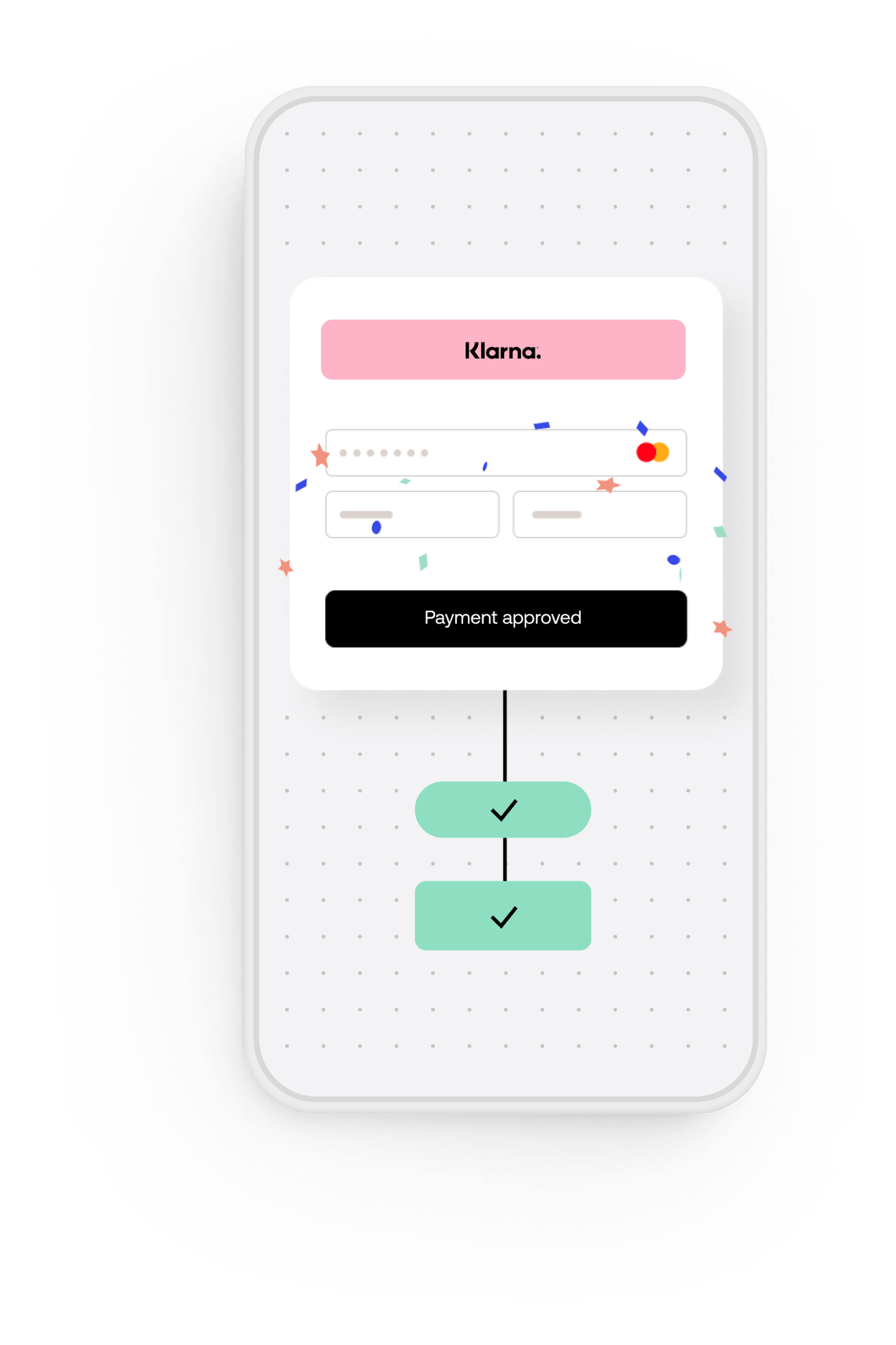
Show. Don't tell.
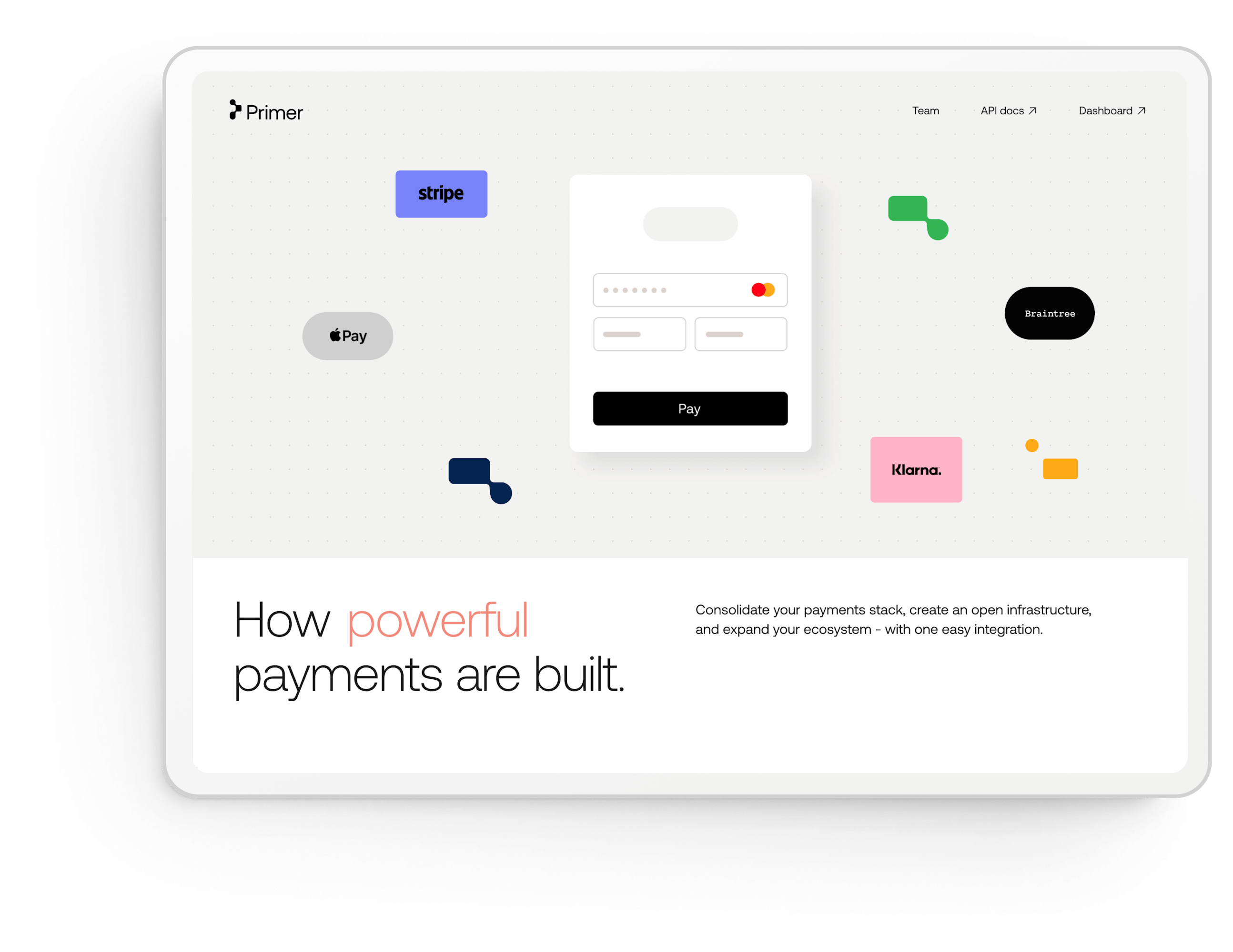
The best way to explain the power of Primer is to let users experience it. This is why we worked hard on showing the product's uniqueness in the market through motion.
We built an interactive hero component that features the entire payment flow in a smooth, organic way. This component lets users put together their own payment infrastructure in just a few playful clicks — a principle we used throughout the site.

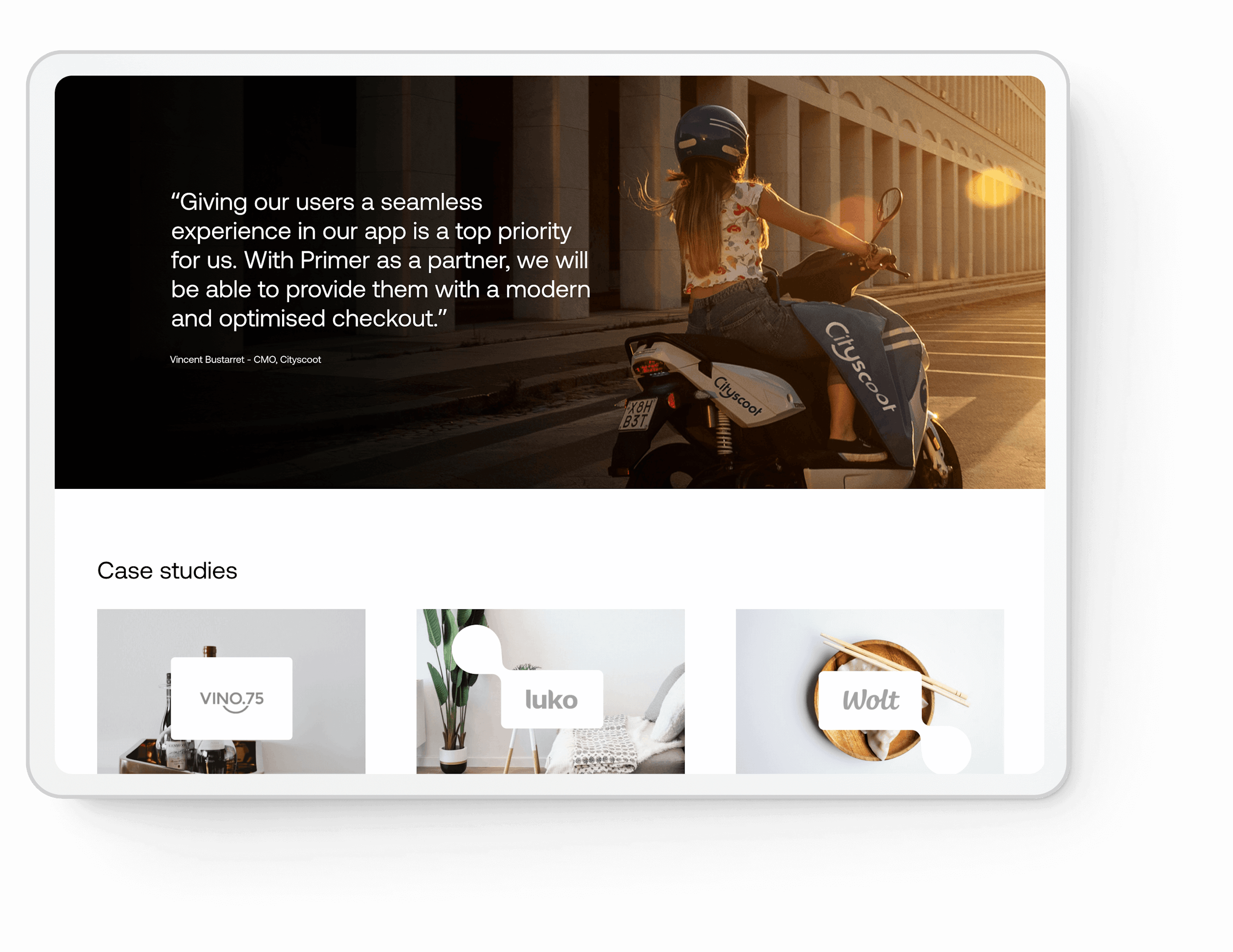
14islands did an amazing job with our website. Their team was totally integrated with ours, and the collaboration was really smooth. They impressed me not only with their design and implementation skills, but also in how they managed the tight deadline and our continuous changes. Just hoping I’ll get another opportunity to work with them soon!
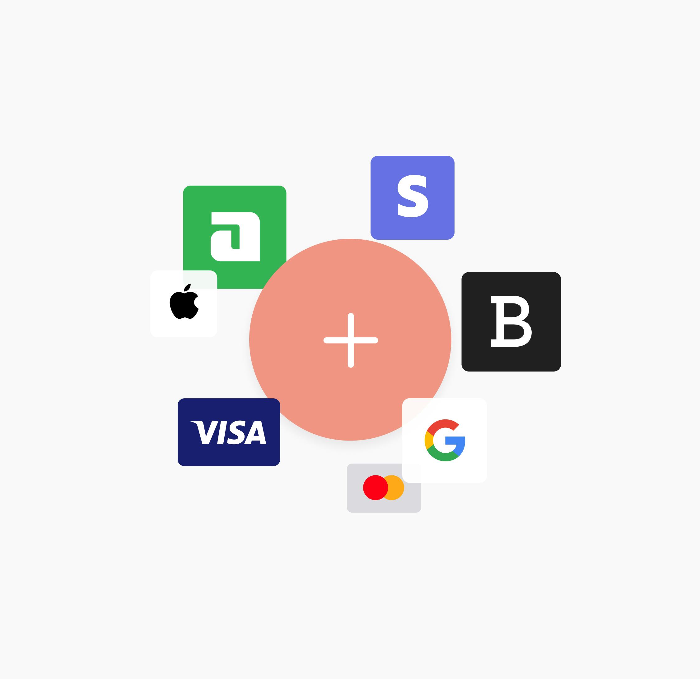
Moving fast at scale
Everything was built to be fast and scalable. There was also room to introduce WebGL in the stack to craft natural animations — something we like to do often.
Contentful was the CMS of choice, and we aligned the whole content structure to fit the needs of the Primer editorial team.
- Gatsbyweb framework
- ReactJavaScript framework
- ThreeJSJavaScript 3D library
- Netlifyhosting platform
- ContentfulAPI-first content platform
- Styled componentsCSS-in-JS styling
For a better payment experience
The whole process was a tight co-creation with the Primer team. The outcome was a successful launch of the new site with raised brand awareness and digital presence taken to the next level.
We thoroughly enjoyed the project and couldn’t be more proud of it. We also agree with Primer that online payments should not just be easy but also engaging and, dare we say it, fun.
